|
|
|
Monday 26 May 2003
Urban Planning
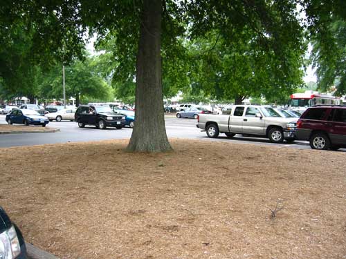
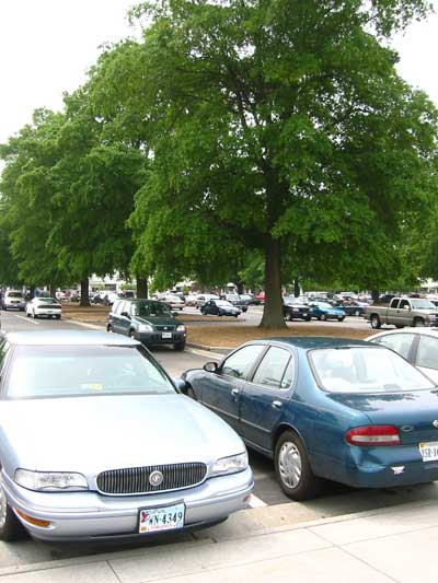
Cars, Parks, and Car Parks Not long ago, Brian Micklethwait on Samizdata wrote about the aesthetics of car parks. Car parks — parking lots — are a necessary part of our environment, and useful, to be sure. But why is it that they’re so ugly? The answer is that they’re designed entirely for cars, and not for humans. The term car park — not much used in the United States — is interesting in this. The problem is that car parks are too much about car, and almost not at all about park. I was recently in Williamsburg, VA, where there is a good parking lot. I was fortunately armed with my camera. The parking lot in question is at an outlet mall that’s otherwise unremarkable. The only thing notable about it is that they left some of the trees alone when the built the parking lot:
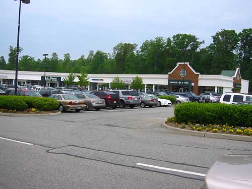
For comparison, here’s a parking lot annex at the same outlet mall, built with no trees in it, a much more hostile environment:
None of these are really ideal spaces, but given that we have to have somewhere to put cars while we’re not actually driving them, the parking lot in the first two photos seems much preferable to the one in the third. The only reason the cars are there is because of the people, yet most parking lots — habitats for both cars and people — are little different from the enormous tracts of asphalt near ports where cars for export are lined up (habitats just for cars). Obviously, it’s less expensive to build an ugly parking lot. Not only do you not have to spend any money on trees, but you get more parking spaces in the same amount of land as well. Very little we build in our society is purely utilitarian, though — even an outlet mall has little architectural embellishments intended to make the thing more pleasant to look at — so I am unconvinced by the utility argument. I think it’s because the need to park large numbers of cars in the same place is a very recent problem. The need for parking lots as such at all has almost entirely arisen since World War II, and it’s within my memory that parking lots have grown so large as to be environments in themselves, rather than just fringes around stores and the like. When I was a child, the parking lot at our suburban grocery store had precisely three ranks of cars in front of the building and on one side: that is, one rank of cars would nose in against the building, and then two more ranks would park nose-to-nose in the lot. The far reaches of the parking lot were no more than about fifty feet from the building. I wasn’t driving then, of course, but I don’t remember parking there ever being a problem. For whatever reason, parking in the suburbs is a problem now, and the solution has generally been simply to pave over more ground for larger parking lots — almost all of which goes unused almost all of the time. This hostility of parking lots is almost certainly costing merchants business, and it contributes a great deal to today’s familiar suburban hostility to further development. Maybe a good short-term solution would be to offer tax credits or zoning breaks to developers who build car parks that function on some level as parks. I predict that were there to be enough of these built, suburbanites would become less hostile to more development, and developers and merchants would come to realize the benefits of having parking lots that were an enticement, rather than an obstacle, for potential customers. Posted by tino at 23:36 26.05.03This entry's TrackBack URL::
http://tinotopia.com/cgi-bin/mt3/tinotopia-tb.pl/129 Links to weblogs that reference 'Cars, Parks, and Car Parks' from Tinotopia.
Cars, Parks, and Car Parks
Excerpt: A nice discussion on the ins and outs of aesthetics of car parking ... Weblog: Urban Planning Blog Tracked: October 28, 2005 04:38 PM Comments
There’s a terrific little book compiled by some Japanese 30-somethings called, ‘Made In Tokyo’ which explores the subject of ‘Da-me architecture’ or ‘No-good architecture.’ In this book (a single volume written in Japanese and translated to English, page for page) photographs and simple diagrams detail the strange combinations of buildings, their functions and lack of architectural importance in the urban enviornment. They go on to explain these spaces’ evolution and their limited life span. These buildings are so unimportant that it has come to be something the Japanese seem poised to reconsider the space’s usefulness, how to better use it all the time- they build it up and tear it down and reuse the space in very short periods of time. Every manner of manipulating these nooks and crannies of space are cataloged here, combining such things as: a Public Bath, Sauna, Laundromat, Convenience Store and Dwelling all in one compact building on a single plot of land. There are many dazzling examples including a Driving School on the roof of a Supermarket, with lanes, lights, ramps for practicing manual transmission inclined starts, etc… Some of the combinations seem beyond that of allowed zoning codes in the States and just plain acceptability of Western people’s notions of how commercial and residential space ‘may’ be used together— which should wake them up to what they ought to be thinking about even when it comes down to better parking lots that help the business that humans are trying to access after they park their vehicles. Aside from this book the city of Tokyo mainly (and a few other cities and communities in Japan) have laws requiring the rooftop designs of all buildings and other urban enviornments to include 20% of planted greenery (trees, flowering plants, shrubs, planes of grass, et al.) which is to help beautify, return vegetative growth to the city, make the air cleaner, and above all else to help reduce or level of the annually increasing temperatures caused by added steel and concrete in the urban landscape. There’s a article in Metropolis Magazine about ‘Made In Tokyo’ and the folks that wrote it. A minimally translated website of the actual book, Made In Tokyo is available too. A bit of clicking around in the ‘DATA’ link will bring up diagrams of these various uses buildings with some English to go by. It’s well worth a few moments to see how others have better illustrated utilizing space and have worked to better the use of car park(s) as eyesores and dangers to humans and their habitats. I cannot locate a source on-line to purchase the book but a call to ‘Kinokuniya’ booksellers in NYC may be of some use in tracking down a copy if it’s a must have. I dislike parking lots as they are. I often find myself complaining about the blistering sun as I run from the lot into almost any type of mall or mega store. Or for that matter treading icy snow piled lots as I negotiate the unknowns of puddles and pot holes. I find there are all manner of unnecessarily difficult manoeuvers to get myself out of blocked in, poorly designed and ill flowing parking situations to be an intentional waste of mine and my automobiles energy— just so Mcdonalds can make it all the more difficult for me to leave the parking lot or cut traffic by slipping thru their lot due to being placed between varying directions of traffic without actual access points being fitted by the D.O.T. when they acquired land for the roads in some difficult traffic situations. It’s wonderful to see that someone had the foresight to leave some of the mature trees in the parking lot you found in Williamsburg. Posted by: chris at May 27, 2003 11:57 AM I found the Metropolis article particularly interesting; it’s one of the few things I’ve read (and this includes a lot of new-urbanist kinds of things) that talks about cyclical building without being explicitly condemnatory of it: “The average wood-frame residential building stands for about 25 years, which also contributes to a cultural acceptance of short-life-span construction methods and a preference for new housing.” Most American commentary does not see short-term construction as something that results from a constant desire for new buildings, but rather ever-newer buildings as a result of short-life-span construction methods and some kind of American short-sightedness. While on the one hand there’s something to be said for the conservation of labor and materials that’s represented by building a single building and then using it for 400 years, over 400 years (or over 40 years), the way buildings are used changes. Forty-year-old houses in the United States are undesirable, because they’ve often only got one bathroom, a one-car garage, and small rooms. People don’t live that way any more. We’ve got a lot of architecture that’s reviled by most architects and that’s widely regarded as “no good”. Unfortunately, very little of it seems to be about cleverly solving a particular problem the way the Japanese stuff is. It’s mostly about satisfying arbitrary zoning requirements for the lowest initial cost possible. Coming back to parking lots: you mention the issue of the McDonald’s restaurant being placed in the way of the exit. There’s a fine line to be walked between the need to make money and the need for a space to be functional; coercive marketing vs. easy access. The cardboard promotional stands you find in grocery store aisles are a great example: they’re there to get you to buy more things and spend more money, but they constrict the aisles and reduce the utility of the store to the point where they result in customers finding the grocery store a more stressful place. Short-sighted thinking would conclude that the Roach Motel is the best model for a mall: once you get in, there’s no leaving. The problem would be that the customers would eventually empty their bank accounts and starve to death. You’ve got to let them out and hope that they’ll come back of their own volition. Posted by: Tino at May 27, 2003 02:47 PM Don’t forget one of the main reasons you don’t see more trees in parking lots is they would obstructe the view of what stores lie behind them. Several years ago a developer in Charlotte NC was building a new box store strip mall. To get teh zoning varance needed to build it they agreed to leave 10% of the trees on the lot. However instead of doing that they bulldozed everything took the financial hit and stated their reason as being they didn’t want to obstructe the view of the stores from the main road. Posted by: Paul Johnson at May 30, 2003 08:35 AM Clearly Charlotte’s fines are not high enough. The outlet mall in Williamsburg has all its stores facing more or less inward; from the road, you see the back of the Nike store and its neighbors. That suggests a reasonable solution, actually. Strip malls are incredibly inefficient, because if you park at point ‘X’, say about 200 feet out from the building and about in the middle of the lot, you’re near one store, but quite far from stores on either end of the strip. If strip malls were built as enormous squares with parking the center, any given parking space would be closer to more stores, and the building could be built much closer to the roads, enhancing that all-important visibility. You’d still have the overall problem of low density, but you’d have density concentrated along the roads and sidewalks, where people are more likely to be. Posted by: Tino at June 3, 2003 11:55 AM Up in suburban Toronto, yes, parking lots are designed to be utilitarian. The maximum number of spots as possible. Many lots also try to minimize the number of li’l islands, even such as shown in the second picture, because they make snow ploughing more difficult. Somewhat related to Tino’s comment: in the mid-90’s, the Ontario government implemented new design guidelines to try and make commercial developments pedestrian- and transit-friendly, one of the biggest recommendations was to bring buildings right up to the street edge; it was accompanied by a picture of a main street in the old part of Toronto, from a streetcar suburb where most of the residents walk to the main street. Well, instead the result is even bigger commercial lots, with a BIG box in the centre of a sea of asphalt, and then a few “pad” structures on the outskirts (but they’re up against the street, so obviously they must be turning it into a pedestrian-friendly sea of asphalt…). Posted by: Brent at January 8, 2004 07:10 PM It’s not just how the parking lot looks; it’s where you put it. A group of stores smack in the middle of a pretty parking lot is still pedestrian-hostile; that is, people living or working nearby are discouraged to walk to this destination. Posted by: Sharon at March 27, 2004 09:07 AM they need to build garages, car lots are eye soars. Posted by: Mr. Palm Beach at May 6, 2004 03:59 PM they need to build garages, car lots are eye soars. Posted by: Mr. Palm Beach at May 6, 2004 03:59 PM It seems to me that there is more than enough room on top of these buildings or even below these buildings to keep the parking lots out of sight. Especially the big box stores. Posted by: andursonne at May 7, 2004 05:03 PM Also, maybe they should experiment with color. Trees are nice but there are smaller ones that won’t block the store as much and during the spring, they flower. Posted by: andursonne at May 7, 2004 05:47 PM http://stripmallv2.blogspot.com/ An ongoing study on stripmalls and proposals for a new stripmall in emeryville, CA Posted by: Byron at October 18, 2005 02:54 AM |


