|
|||
|
Friday 07 October 2005
Media
The Complete New Yorker The Content The first thing you notice about the new New Yorker archive collection, with every issue of the magazine up to February, 2005 on eight DVDs, is that the physical package was designed by an idiot, or a sadist. It’s a folder, nine inches wide by twelve inches high; the DVDs are in a further fold-out section on the right, and a rather nice book on thick paper with ‘highlights’ from the magazine over the years is glued into the folder on the left. If you think about that for a moment, you will understand why I say the designer was an idiot; if you try to read the book without having the whole assembly laid flat on a table, you have to deal with the DVD section— which is twelve inches by twenty-seven inches when unfolded, which it will quickly be if you’re not careful — flapping about. In short, it’s impossible to read the book without a table, or a third hand. If the DVDs had been put on the left, though, and the book on the right, the open cover of the book could have been grasped along with the DVD section by the left hand, while the rest of the book could have been grasped with the right hand, in a way that will be familiar to anyone who has ever read, say, a magazine. This is a small thing, but as the utility of the whole product could have been improved immeasurably at absolutely no cost, it’s nevertheless an annoying thing The second thing you notice about The Complete New Yorker is that in the accompanying book of highlights from the magazine (cf. above), of the book’s one hundred and twenty-two pages, six are devoted to articles about the war in Iraq, and three to the whole of World War II. Or maybe four, if you count a Janet Flanner profile of Hitler in 1936. The New Yorker’s politics haven’t changed — to the extent that it has an editorial outlook at all, it’s always been left-wing, and about as left as it is today. Recently it does seem more bitter about its politics, but this is hardly something that is unique to the magazine. It’s particularly a shame for the New Yorker, though, because its whole style is very much about being supercilious and aloof. The voice of the New Yorker is the voice of someone who is supremely confident that he knows better than everyone else. For a person with that outlook to even appear to be bitter is to be defeated. The Technology The Complete New Yorker comes to you on eight DVDs, packaged in the aforementioned terrible folder/book thing. The marked price is $100, so the fact that the DVDs are housed in a scratchy cardboard sleeve is a bit galling. Overall, the technology of the collection isn’t really bad: by which I mean that it is merely very bad. In the late 1990s, National Geographic put out a 31-CD set with their entire 110-year archive on it. The thing was an unbelievable dog, and effectively unusable. The scans were of such low resolution that you could barely, by squinting mightily, manage to read the text; printouts were totally illegible, and you could not copy and paste from within their proprietary interface. I was worried about some of the same issues coming up with The Complete New Yorker. Nearly all of them are there, but improvements in computer technology have resulted in these things being merely annoying, rather than crippling — as long as you are patient. The biggest problem is the speed. The indexes for authors, articles, etc. are stored in a SQLite database, and the magazines themselves are stored as DjVu files of about 10 MB each. 10 MB for a whole magazine, with the illustrations and photos looking good and even the smallest text readable, is amazing. Despite the fact that the Complete New Yorker uses this fairly open and standard technology, though, you’ve got to use their custom application to read the files. They’re stored in some kind of ‘secure’ DjVu format. And this is a problem, because the application you need to use to read the files is a dog. I timed the thing’s responsiveness on my Mac Mini with a 1.42 GHz G4 processor and 1GB of RAM:
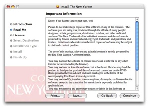
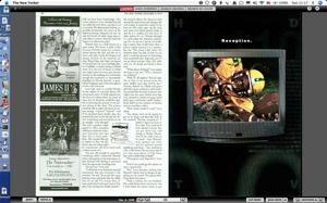
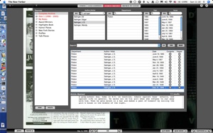
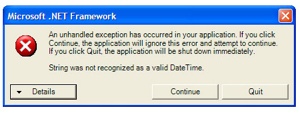
This means that, once you are reading a given issue, you are pretty well committed to that issue. If you are reading the October 4 issue and want to see something in the October 11 issue, you are going to have to go get a cup of coffee while you wait. It could be worse, I suppose. The license statement is unusual: Almost all commercial software licenses are mainly about threatening and insulting the customer. This one doesn’t give you any more rights than any other commercial software license I’ve ever seen, but at least it’s polite about it. What’s less polite is that the installer insists on restarting the computer when it’s done — despite the fact that there isn’t anything installed that would require a restart. After the installation completes, but before you restart, the install DVD can’t be ejected because the system thinks there’s a file open on it. This is probably the whole reason for the restart. When you’re done restarting, the single most annoying thing about the application — even more annoying than the fact that the whole thing uses non-standard UI widgets — is that the window has two sizes: covering your entire screen, or minimized. If you’ve got a screen that’s larger than is needed to display the pages, The New Yorker helpfully takes over the remaining real estate in order to display pleasing gray borders. On my PowerBook, this means that when viewing a full spread, about 20% of the screen is simply wasted. Far worse than that, though, is the search window. The search window is not customizable, not resizable, not able to be modified in any way. The ‘Article Abstract’ pane is always 756 pixels wide and 88 pixels high, no matter how long the abstract is. There is always room for fourteen search results, no less and no more. There are always over 140,000 pixels dedicated to the ‘Sources’ list, whether the user wants to use that list or not. If you want to narrow your search down to a few specific years, departments, or authors, and then dedicate more screen space to the search results themselves, you are out of luck. Similarly, the search results cannot be sorted in any way. Generally they’ll come up in chronological order, but not always. Want them listed in chronological order? Too bad. Oh, yeah, and it crashes a lot, too. And the program officially calls itself ‘toolbars’ for some reason that is entirely beyond me. I suppose I should consider myself lucky I use a Macintosh, and not only for the usual reasons. Under Windows, the hideous and useless ‘Safedisc’ system is used in an attempt to ‘secure’ the discs against copying: because otherwise the teen h/\x0rz would be all over trading 50 GB of smug cartoons and Hammacher Schlemmer ads. A far more effective copy-protection system is embedded in the Windows version of the application itself. As soon as you run it, you see this: If you click ‘continue’, the error message goes away, until you attempt to do anything else. I have not, as of yet, managed to get the Windows version of the program to display any actual New Yorker content at all. This has got to deter copying quite a bit. Maybe people would like to give copies to their enemies, though: I have no idea. Those whom the gods would frustrate, they first make buy software for Windows. Presumably it is possible to get the thing to run on Windows; it’s not really conceivable that they let it out the door without testing at least that much. My guess is that its SQLite engine and my version of the .NET Framework don’t get along. I don’t see why this should be my problem, though. So the software is bad. I don’t know who developed the stuff, and I don’t know what kind of requirements were imposed on the developers. But I do know that there appears to have been a lot of effort put into things that don’t pay off. There are over a hundred little pictures and things embedded in that application, totaling almost 4 MB, that duplicate things that you get for free from the OS if you don’t need your application to look and behave in its own unique way.
On the left you see the Complete New Yorker print button. It’s a 28K TIFF, and someone had to create it for this application. (And they had to create another, slightly different one to be displayed while the button is pressed.) On the right is the standard Macintosh print button, used everywhere else. It was created by professional button designers at Apple, and is present on every Macintosh. You just tell the system to display the print button, and whoomp there it is. The thing is, you don’t want your application to behave differently from all others; the custom UI widgets are worse, not better, than the standard ones. Not only haven’t they had the same amount of attention and thought put into them (Apple can amortize its UI-design expenditures over a far larger number of sales), but the users aren’t used to them. If you use the standard widgets, you get to take advantage of everything the users have learned from using other applications. And what’s more, you get to use your development resources to make things work properly, rather than to tweak the appearance of things. Had the New Yorker been able to tolerate their collection looking like a normal application, rather than a lifestyle accouterment, the lists would have been sortable, the windows resizable, and the whole thing easier to use — and they might have been able to work out at least some of the more debilitating bugs before shipping the product. The information available in the Complete New Yorker is amazing: a history of the last eighty years in the life of the USA, as seen through the lens of snooty bourgeois pop culture. Many of the best writers in America, and in the world, contributed to this document, and even the advertising is interesting beyond all belief. Unfortunately, the system you must use to view this document is terrible, and will be entirely useless far sooner than the collection itself will be. Is it possible to do better? Yes, and very easily. The documents themselves are locked up, though, and thanks to the DMCA it’s a federal crime to reverse-engineer their ‘protection’ schemes for the purpose of getting better access to the information that you paid for. There might be hope for the future. I have read, here and there, that the New Yorker plans to release a new disc each year, so as to keep the collection up-to-date. If they actually do this — I will be surprised — they’ll have a chance each year to update the application, and presumably to make it work better. At $60, it’s still a reasonable buy as it is: the magazines are worth many times that. It’s really a pity about the application, though. I’m sure that, before long, someone will manage to reverse-engineer the content-protection scheme. Once the content isn’t so ‘protected’ from the people who’ve bought it, the collection will become much more valuable. By that time, though, the New Yorker will probably have remaindered half the run at $10, claiming that ‘piracy’ cut into their sales and vowing never to offer anything like this again. Posted by tino at 18:39 7.10.05This entry's TrackBack URL::
http://tinotopia.com/cgi-bin/mt3/tinotopia-tb.pl/483 Links to weblogs that reference 'The Complete New Yorker' from Tinotopia. Comments
The Windows problem is caused by requiring US format dates as set in the Regional controls in Control Panel: switch from whatever you have (which is probably day/month/year) to month/day/year and it works like a charm. I learnt this after reading your post and searching a lot, and finally found a page from a Brazilian site which (once Google translated it for me) made it all clear: By the way, tip of Uncle Filthy who to buy or to lower Complete New Yorker and to find problems to use the installed program after: case you receives a long message from error starting for “System.FormatException: String was not recognized the a valid DateTime “, is alone to go Regional the Panel Control > and Language Options > Customize > Date, in the Windows, and to modify the standard of date for mês/dia/ano or ano/mês day, and not dia/mês/ano it usually used by the Brazilians. So hat’s off to Uncle Filthy. I make no comment about the rest of what you say. Posted by: Found elsewhere on the net at October 18, 2005 02:52 AM Duh. You bought the $100 version. Next year the $500 version comes out with just raw PDFs on the discs. Posted by: Jimmy S at October 18, 2005 12:42 PM Were you running other applications when you timed out the load times for the program? If you were running as many as it appears you were in your screenshots, that may have easily slowed it down. Posted by: Ryan at October 18, 2005 06:30 PM Having a lot of applications running doesn’t really slow the Mac down that much; but I did time the application’s responses after rebooting and with nothing else but basic system processes running. Posted by: Tino at October 18, 2005 07:03 PM A shame such an interesting idea has been so crippled by a horrible user interface. To think, somebody had a really good idea of selling every New Yorker issue ever, in a searchable, browseable format. What a treasure of knowledge in one package at a very reasonable price. And then they made it very difficult to actually use by wrapping it in a disaster of an interface. One addition annoyance you didn’t mention was that you can’t save time by copying the contents of all the DVDs to your hard drive. I have 300 GB of free space. I ought to be able to install the whole thing to my disk, which would greatly increase speed, and eliminate the horrible annoyance of constantly having to swap discs when moving from issue to issue. Posted by: Mike Silverman at October 18, 2005 11:46 PM I got rid of most of the Windows problems by simply hitting “check for updates”. As for the other difficulties — it’s worth putting up with them just to have the text available. But yes, the folder was certainly designed by a sadist! Posted by: Mike Hobart at November 1, 2005 12:58 AM Thanks for this review, it is exactly the sort of information I was looking for. Hey, maybe a whole bunch of Complete New Yorker owners could contribute to a full index (sort of like the Wikipedia project but with real content!) or some other collaborative way to make this resource more useful and usable. Posted by: James at December 19, 2005 10:48 AM |


