|
|
|
Friday 02 December 2005
Rant
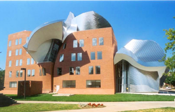
Eyesore Of The Month I periodically like to call attention to James Howard Kunstler’s Eyesore of the Month feature: ‘Architectural blunders in monthly serial’. He hasn’t got one up yet for December, but if you’re unfamiliar with the thing, there is already an archive of dozens of the things. While poking in there just now, I came across this, the featured eyesore for October 2005:
You know, I don’t entirely dislike Frank Gehry’s work: there’s definitely room for it in the world. This thing works because it incorporates such a bland building as its base; it winds up effectively making the brick cube seem more rectilinear than it would if it were all right angles, because the melting and distortion calls your attention to the things that aren’t melted. The corner nearest us in this photo is nice and crisp and proud, but it would just be boring if it weren’t for the Gehry garbage piled around and on the building. But here’s the thing: quite a bit of Gehry’s work, particularly of late, is a one-trick pony. We get it now: it’s possible to build buildings that look like they’re falling down, or like they’re strange intersections of things from other dimensions. Bravo. Now either come up with some new ideas, or stop holding yourself out as some kind of icon of architectural creativity. Anyway, truly great architects know how to create new, interesting, original buildings that exist in some kind of harmony with their surroundings, and that are as useful as they are good-looking (or at least striking). If they’re economical to build at the same time, so much the better. Gehry’s buildings are none of these, anymore. Why people — increasingly museums and other non-profit entities now, I note — continue to subsidize his vanity is beyond me: I suppose they’re afraid of being though to be philistines. Posted by tino at 09:46 2.12.05This entry's TrackBack URL::
http://tinotopia.com/cgi-bin/mt3/tinotopia-tb.pl/494 Links to weblogs that reference 'Eyesore Of The Month' from Tinotopia. |
