|
|
|
Monday 28 November 2005
Review
Nerd TV Sucks So I just downloaded Nerd TV #10, where Bob Cringely interviews Dan Bricklin. Bricklin is a particularly interesting guy, and pretty articulate and normal compared to other computer-industry old-timers, so I was expecting something good.
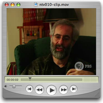
The reality? It’s useless. I listen to a lot of podcasts, and nothing I listen to for more than about three seconds sounds as bad as this. My home movies sound better than this. Nearly all public-access TV is (at least technically) better than this. Apparently — this information is on Dan Bricklin’s weblog and seemingly nowhere else, certainly not on the Nerd TV site — Bricklin’s microphone failed, and all the audio is from the microphone on Cringeley’s shirt. That doesn’t explain why Cringely also sounds like crap, or why every episode of Nerd TV has sounded like it was recorded at the bottom of a well. It doesn’t explain why there’s even noise in the background of the record-it-once announcement at the beginning about the whole thing being supported by a grant from the CPB. It doesn’t explain why there’s been no noticeable improvement in the production quality after ten episodes. If you went up to Boston solely or primarily for the purpose of recording an interview with someone, wouldn’t you check to see whether his microphone was working? Cringely wouldn’t, apparently. It is a shame that he is squandering his access to these people (and to the presumably free bandwidth available to him for distributing this stuff) with such poor production values. See a 14-second clip here. Posted by tino at 15:21 28.11.05
Monday 21 November 2005
Spam
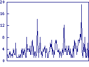
Spams Per Hour This is written mainly so I have something to link to from the spam graph. The Tinotopia ‘spams per hour’ graph records the number of messages that the spam filter on tinotopia.com judges my e-mail account to get; it shows the last seven days. In this case, it shows that I got about 20 spams in one hour sometime late last night or early this morning:
There have also been two smaller spikes in the past week; looks like the night before last and a few days ago. This chart doesn’t count the mail that’s bounced because it’s sent to addresses that don’t exist, or because it’s coming from a known spam source: those are rejected by the mail server itself, and they never get to the spam filter. Generally, about 50% of the mail that arrives at the server is rejected outright. The chart also doesn’t count ‘false negatives’, or spam that actually makes it through to my inbox because it’s too subtle for the filters to catch. At the moment, there are about five to ten of those a day. Posted by tino at 13:02 21.11.05
Technology
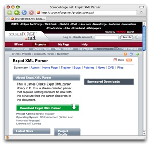
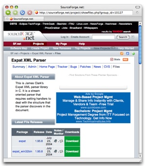
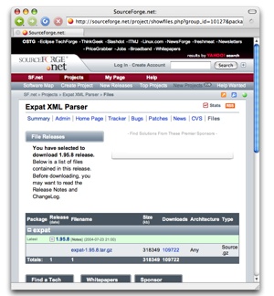
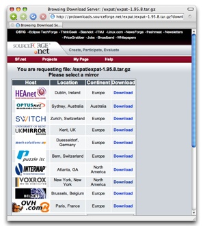
Downloading Software Is Needlessly Complicated So I have recently come into the misfortune of having to screw around with a lot of XML, and I’m poking around for the best way of doing it. In thus poking, I have been reminded of one of the things that particularly annoys the hell out of me. While attempting to install a particular tool, I was informed that the tool I was installing relies on another tool, and that I needed to install it first. The installer was even nice enough to point me right at the other tool. It’s available at http://sourceforge.net/projects/expat/. Excellent. So I paste that URL into my web browser, and get this page: There’s a nice big green link for ‘Download Expat XML Parser’ right there: still excellent. I click on it. Hmm. The button I clicked on said ‘download’, but it appears that it would have been better labelled ‘make more choices’. So I click on the ‘Download’ link for ‘expat’, having no need for Windows binaries of anything. I get this: That button would have been more accurately labelled ‘make yet another choice’ — only in the case of this particular project, there’s not actually a choice here. Many of the projects on Sourceforge would have a number of different options here — which is still annoying considering that I’ve already clicked on ‘Download’ twice — but in this case it’s especially asinine as there is no possible choice for me to make here. It’s nothing but a waste of my time. The astute observer will note that there is no download link here. Instead, there’s one link for the package, and another for the download history of the package, for some reason. After I’d clicked on ‘download’ twice, the system’s designers thought that it was possible that what I really wanted was the opportunity to see a download-history graph. I see. So I click on the ‘expat-1.95.8.tar.gz’ link. Finally, maybe, I’ll be allowed to download the damned thing, right? Of course: wrong. Instead, I get this: Now, I am presented with a list of mirrors that offer the file. The order of this list changes, presumably at random to spread the load around. However, the list also gives me the location of each mirror (including helpful information like the fact that Paris is in Europe, New York in North America, and Sydney in Australia). So what’s going to work best for me? Using the mirror on the top of the list, or using the closest one? In practice, it probably doesn’t matter any more, but long habit causes me to look for the mirror closest to me. (The list, of course, doesn’t say anything about what networks these things are on, which is the most important thing about them.) It is possible to select a default mirror, but the cookie used to store this information seems to expire pretty rapidly, so I don’t bother any more. Anyway, I click on the ‘Download’ link for New York. The ‘Download’ link doesn’t actually link to the file I want, of course; it links to a redirector that Sourceforge uses to count the load on the various mirrors.
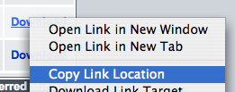
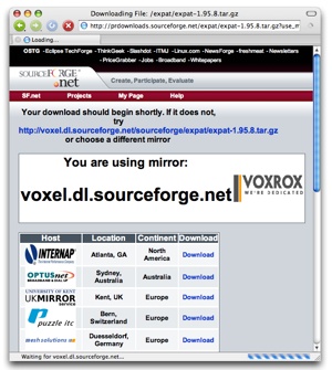
This means that if I just right-click on the ‘Download’ link and copy the URL — if, for instance, I am using my laptop’s web browser but actually installing the software on a different computer, as I usually am — it doesn’t work. The URL I get isn’t the URL of the file I’m actually trying to download, but rather http://prdownloads.sourceforge.net/expat/expat-1.95.8.tar.gz?use_mirror=voxel, which results in this page: A web browser that understands HTTP redirects will display this page, and then download the actual target file. A simple command-line fetch utility like wget will not, because there’s not actually a real HTTP redirect involved; instead, the web page that’s returned begins like this:
That META HTTP-EQUIV business is a hack that tells the web browser to wait five seconds, and then to request http://voxel.dl.sourceforge.net/sourceforge/expat/expat-1.95.8.tar.gz, which is the file I was after all along. You will note that this page actually has on it as a regular, visible link, the direct URL for the file I want: I can copy this one and then use it to download the thing directly to the remote machine. But I’ll still wind up with a copy of the file on my laptop, because the browser will start downloading it in five seconds. All I had to do was click on three links labelled ‘Download’ (none of which actually pointed directly to the download in question) and one labelled with the name of the package in question, and then copy the fabled Golden URL that actually leads to the file. Oh, and later I’ll have to delete the extraneous download from my laptop. Ah, technology! This all sounds like pretty small beer, but when you’re downloading a lot of things it gets old, fast. And these days it’s very rare to find someone who’s distributing software — commercial or open-source — whose ‘download’ links actually lead directly to the file you’re looking for. There’s no need for it, and I decree that it should stop immediately. Either pick a mirror for people automatically (it’s not that hard), or offer them a list of direct links to the mirrored content. Stop forcing users into pointless decision trees, and for God’s sake stop designing your damned systems for the convenience of your statistical analysis. Instead, start designing them for the convenience of your customers. Posted by tino at 11:50 21.11.05
Tuesday 08 November 2005
Customer Service
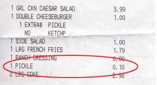
Customer Parity and IT at McDonald’s The McDonald’s restaurant in Front Royal, VA offers a real bounty of customer-service lessons. The place is actually not all that bad by the standards of modern McDonaldses, and most of the problems seem to be pretty deeply rooted in the McDonald’s system rather than in the local management. There’s still a lot of room for improvement there, but the place is still a cut above most Front Royal fast-food establishments, and they do at least seem to try. Anyway, the other day Nicole and I were in there, and ordered our usual food. Nicole ordered her burger with extra pickles, as always. But this time there was something new:
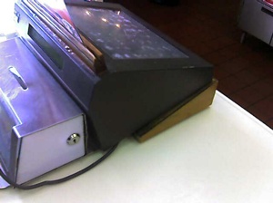
What was new was a $0.10 charge for ‘pickle’. Now, this could have been entirely in error. McDonald’s cash registers are one of the world’s great stories of UI failure: there’s hardly an aspect of them that isn’t done wrong. Start with the physical device itself: McDonald’s uses an odd model of cash register, suggesting that they’re either custom-made for McDonald’s or at least targeted pretty directly at the fast-food business. Yet they all have some home-made-looking thing jammed under them to change the angle of the screen so it’s readable. In some places, I’ve seen the cash registers propped up on piles of paper napkins. At the Front Royal McDonald’s, the napkins and little plywood wedges aren’t enough: the placement of the light fixtures behind the counter means that the employees still have to shield the screen with their hands, move their heads around, and squint. But that’s not the half of it. One of the reasons so much squinting is required is that the UI of the things seems to be unnecessarily complicated, possibly as a reflection of the unnecessarily-complicated nature of McDonalds’ menu. When you order anything with anything else, or without something, the process has a tendency to go off the rails. (Or maybe you don’t have to order anything special: the other day, I saw a customer walk up and say ‘Number 4’. That’s all: ‘Number 4’. This is some biscuit-hashbrown-coffee combo. Fully twenty seconds of screen-tapping ensued behind the counter.) The entire interface of the cash register is an LCD screen; it can change dynamically. It doesn’t appear to, though. The computer system knows certain things — or, in any case, it should know certain things — about the menu, and it could use this knowledge to make the job easier, faster, and (presumably) more profitable. This is easier to demonstrate than explain. Let’s say that you order a Big Mac, and that you want to make some changes to the standard burger. When the employee hits the ‘Big Mac’ button, two other buttons should light up: ‘With’ and ‘Without’. If the employee hits ‘Without’, the system — knowing about the menu, mind you — would only present the employee with buttons for ‘Two all-beef patties’, ‘special sauce’, ‘lettuce’, ‘cheese’, ‘pickles’, ‘onions’, and ‘sesame-seed bun’, because those are the components of a Big Mac (the thing also comes with ketchup and mustard, but these are not mentioned in the song so I am leaving them out here). If the employee hit the ‘With’ button, the system would present a list of things that can theoretically go on a Big Mac: ‘more pickles’, ‘tomatoes’, etc. The system doesn’t seem to do this, though: in fact, it makes the employee navigate through a series of sub-menus to access certain burger-customization directives, because the entire McDonald’s system appears to be set up from the perspective of the kitchen, not the customer. But I digress. We were charged $0.10 for extra pickles, which may have been a mistake attributable at least in part to McDonalds’ obtuse IT, or which may reflect a new push for increased profits through nickel-and-diming the customers. Note that the Double Cheeseburger was ordered without ketchup, but that no credit was applied for this omission. This is a violation of Customer Service Rule #17, Practice Customer Parity. The example given in the rule has to do with offering refunds in the same form in which the customer originally paid (i.e. you shouldn’t take cash from him for a purchase and then, when he brings your defective merchandise back, offer to mail a check from headquarters in a week), but this is another important point: if you charge for small extras, you must offer credit for omissions. If you feel that you must be paid for such things as two extra slices of pickle, then the customer is quite justified in feeling that he should not pay for anything he’s not getting. The simple solution is to build in a margin for things like extra pickles on every nth burger. The pickles aren’t free, and as McDonald’s is in business to make a profit the pickles have to be paid for somehow. In every business, there is a limit to the amount of goods and/or services that can be delivered for a given price. Calling undue attention to this fact, though, can only end in disaster. If you make it clear that you are carefully parcelling out the ketchup, napkins, pickles, or what-have-you, as a customer I am going to be quite vigilant that I get everything that’s coming to me: Weigh those fries, mister! Far better to rely on a process of give-and-take, while managing your overall process to make sure that the give remains in balance with the take. Posted by tino at 11:36 8.11.05
|
